Saturday, November 27, 2021

How to Achieve Blurred Backgrounds in Portrait Photography

 A Post By: Darlene Hildebrandt

How can you create a beautiful, soft blurred background, like the one you see below?

background blur camera

It’s a question I hear over and over from my students. But there’s a major misconception among new portrait photographers: that to achieve such a stunning background blur, you need to go out and buy an expensive lens.

And this is just plain wrong.

Because while it’s true that certain (often expensive) lenses are better for creating blurred backgrounds, it’s also true that several other key factors go into achieving the soft background look – and most photographers fail to consider these factors and how they can be used for gorgeous results.

In other words:

You are capable of creating a lovely blurred background, and you can probably do it with the lenses you already own.

So if you want to learn how to create that gorgeous background, then read on!

Four factors affect background blur

Whenever you see a beautifully blurred background, know that four factors together produced the effect:

  • the aperture setting
  • the focal length of the lens
  • the distance between the subject and the background
  • the distance between your camera and the subject

If you use a wide aperture, you’ll get a blurry background, sure – and this is what most photographers think of when they see beautiful background bokeh.

But you can use a relatively narrow aperture and achieve the same look with a longer focal length, or by increasing the subject-background distance, or by getting closer to your subject.

So even if you have a lens with a relatively narrow maximum aperture, such as f/5.6, you can get the look you’re after. You just have to carefully control the other background blur factors.

Make sense?

The background blur factors: a quick demonstration

To demonstrate the factors affecting background blur, I’ve created some example photos of a friend’s daughter (she was a more willing subject than my husband!).

This first set of images was taken with my subject about two feet away from the front door of the house. The focal lengths used for all the example shots are (on a full-frame body) 16mm, 35mm, 70mm, and 150mm; note that I backed up with each shot to keep the framing constant. Also, I am deliberately not divulging my aperture, though it is the same for every image.

subject with different focal lengths

Now, the second set of images below was taken with my subject about 20 feet away from the house. Again, each time I changed focal lengths, I moved farther away to keep my subject the same size in the frame.

example portraits with subject farther from background

Now take a careful look at each set of images. What do you see?

Did you notice how much softer the background is in the second set of images? Especially at the 150mm focal length?

Remember: All eight images were taken with the same aperture. The only adjustment made for the first set is the lens focal length. And the only difference between the first set and the second set is the distance between the subject and the background; I had my subject move several feet forward.

But what about the aperture?

As you know, I deliberately withheld the aperture – but would you be surprised if I said that all the images were taken at f/5.6?

It’s true! I used an f/5.6 aperture for each shot. Not the first aperture you think of when someone says “blurred background,” right?

Which means that, as long as you have a lens that can shoot at f/5.6, you can get the same exact look.

One more comparison using f/2.8

Just to further prove the point, here are two more sets of images. All the shots are taken at f/2.8, though the first set shows my subject positioned close to the house, whereas the second set shows my subject positioned away from the house.

Can you see how much more the focal length and the distance between the subject and the background affect the background compared to the wide aperture? There’s not a big difference between these shots and the shots at f/5.6 – but there is a huge difference between the images shot at different focal lengths, as well as the images shot with the subject close versus far from the background.

background blur at f/2.8 examples
background blur at f/2.8 (taken farther away from the background)

Capturing blurred backgrounds: key takeaways

While using a wide aperture is a factor in creating a blurred background, it is not the only factor. And in my opinion, it’s not the most important.

Instead, if you want to create beautiful backgrounds, make sure you:

  • Use a longer lens (I generally shoot at 85mm or longer for portraits)
  • Ask your subject to move away from the background (note that this also depends on the environment, so make sure you do a bit of location-scouting before taking out your camera!)

You can also consider getting closer to your subject; this will increase the blur, though it’ll also tighten up your framing – just something to keep in mind.

Now, go look at the image at the top of the article again.

It, too, was taken at f/5.6! Bet you didn’t guess that the first time you looked at it, am I right?

And here’s one last set of examples to show you the power of a long focal length plus a distant background:

portrait of girl at f/2.8 background blur camera
Taken with a 200mm lens at f/2.8
portrait of girl at f/2.8 with blurry background
200mm lens at f/2.8
portrait of girl at f/5.6 blurry background in-camera
200mm lens at f/5.6

Background blur: final words

Now that you’ve finished this article, you know how to create stunning background blur – and you know that you don’t need an expensive f/1.2 lens to make it happen.

In fact, I challenge you to test this out yourself. Find a willing subject, start them close to the background, then slowly move them forward. Test out different focal lengths, different apertures, and different distances to your subject.

In the end, you’ll have some stunning shots – even if you only shoot at f/5.6 and beyond.

Thursday, November 11, 2021

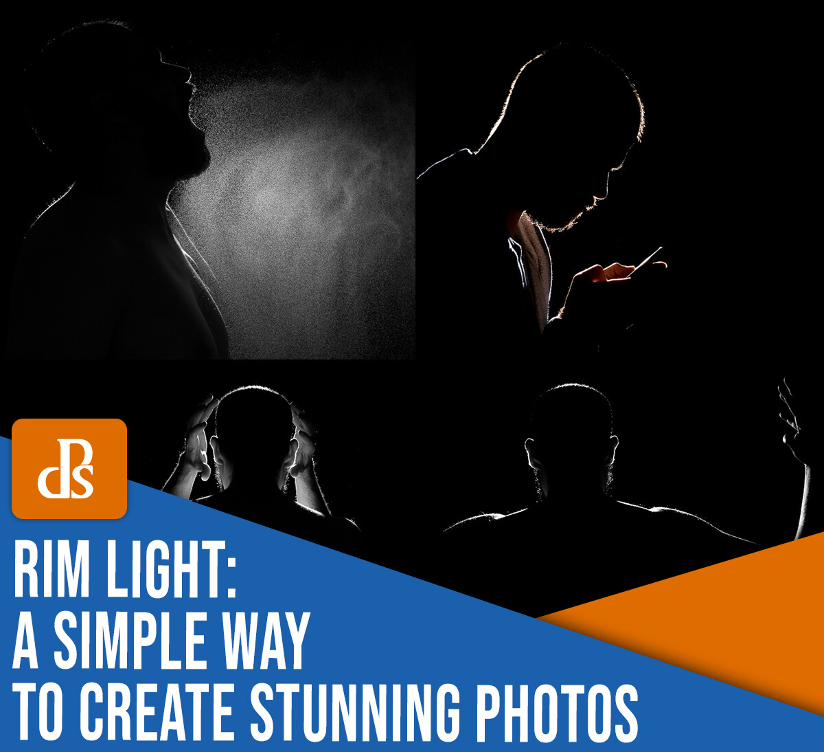
Rim Light: A Simple Way to Create Stunning Photos (With One Flash)

 A Post By: Andrea Minoia


rim light photography a simple way to create stunning photos

In this article, I’ll introduce you to rim lighting – and I’ll explain how to create a rim light with a single flash.

Rim lighting isn’t especially common, but it’s extremely easy to create and will allow you to capture interesting and powerful images like this:

rim light photography

And all you need is an external flash.

(The only other accessory you might want – for added convenience – is a light stand or a tripod to easily keep the flash in place.)

Let’s dive right in!

Learning flash doesn’t have to be hard

If you are just getting started in portraiture, chances are you have been faced with the “flash versus natural light” dilemma, and you probably went with natural light. I find many amateur and beginner photographers are intimidated by lighting equipment because they think that in order to get something good, they have to use complicated setups with many pieces of equipment.

But in my opinion, the problem with learning to use flash is that the easiest possible setup – a single flash used off-camera – is often presented as a way to create a basic image that always needs to be improved by adding more gear and by creating more complicated lighting setups. As if no serious photographer would ever use just one light.

So I can see why flash photography is intimidating.

However, the idea that flash portraits require more than one light to look good is simply false. There are plenty of great one-light setups, including the rim lighting technique I explain in this article.

What is rim light photography?

In rim light photography, you create a rim light – that is, a ring of light that goes around the

rim of your subject. Like this:

rim light photography with low-key style

Rim lighting and a low-key style are a powerful combination.

Note that the flash highlights only the contours of the subject, so the photo looks dramatic and cool and wonderfully graphic.

How to create a rim light

The rim light setup is simple. Just hide the flash right behind the subject, then point it back (so it’s facing toward you, the photographer).

When you fire the flash, it’ll be mostly blocked by your subject. But some light will hit the subject’s edges and make a stunning rim.

You might see rim light photography as the opposite of a silhouette, where the subject is a black shape against a brighter, often white, background:

rim light photography
Self-portrait silhouette.

In the studio, the light setup for a silhouette is, in fact, the same as that used to create rim light, except the flash is pointing at the background instead of at the subject.

For rim light photography, you ideally want to work only with the rim light and not record any ambient light. However, this does not mean you have to work in a dark room. Your flash power just needs to greatly overpower the ambient light – that way, no ambient light affects the scene.

However, you do need to be careful with the flash output. It’s important that the power is strong enough to obliterate any ambient light, but not so strong that light spills over and around the subject’s edges. You only want light running along the subject’s contours.

rim light from behind
Rim light photography is all about that thin light running along the subject’s edges.

Refine your rim light with editing

Once you’ve taken a rim light shot, do a bit of editing. Make sure the blacks in your image are deep and the highlights are bright. That way, you can get a truly low-key photo, like this one:

rim light photography
Here, I’ve allowed the light to spill a bit more, so as to light my hands and the mobile phone screen.

And that’s pretty much all the post-processing you need to do!

What I like about this technique is that the resulting photo has a mysterious look that captures the viewer’s imagination.

Adding emotion

Rim light is great for conveying emotions. We had a new baby girl a few months ago, and before the due date, I experimented with a rim light in the living room with my pregnant partner.

I decided to take the usual, very cliché photo of the father kissing the belly of the mother. But while kissing my partner’s baby bump, I had the vision of the sun rising from behind the Earth as seen from space, and I thought, “Use a rim light!”

This is the result:

rim light photography
Rim light can transform a cliché image into a very moody and interesting one.

I think this simple light setup transformed the same old photographic cliché into a much more powerful and interesting image.

Include special effects in your rim light photos

Because a rim lit scene is backlit, an easy way to add interest is to include smoke or aerosols in the shot. Both will capture the light and scatter it around, creating some interesting effects.

I sprayed water to make this self-portrait shot more interesting:

rim light photography water effects

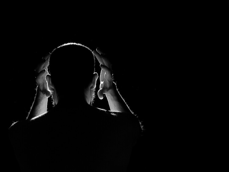
You can also try to turn the model toward the light and allow the flash to light their front for an interesting result:

rim light photography man with hands around head

Rim light photography: final words

I hope you’ve enjoyed this rim light tutorial. And I hope I’ve given you some ideas for playing with an off-camera flash in a simple and non-intimidating way.

The bonus is that, even as you learn flash, you can create some stunning photos!

Now over to you:

Have you tried rim light photography? Share your images (and tips) in the comments below!

Sunday, November 7, 2021

Fill Flash Photography: How to Get Beautiful Portraits (Even in Bad Light)

Fill Flash Photography: How to Get Beautiful Portraits (Even in Bad Light)

A Post By: Lily Sawyer

What is fill flash photography, and how can you use fill flash for beautiful portraits?

As a longtime user of flash, I’m familiar with all the standard struggles (in fact, when I first purchased a Nikon speedlight, I was very scared). But over time, I became a confident user of fill flash, and you can, too.

In this article, I’m going to tell you everything you need to know to get you started with fill flash. First, I’ll explain what fill flash actually is and why it’s important. Then I’ll go on to give some tips that’ll make your flash look as good as possible. Along the way, I’ll share a few simple tricks for getting creative results with just one flash.

Let’s get started.

fill flash photography example

What is fill flash?

Fill flash in photography refers to the technique of filling in shadows with artificial light, such as a speedlight or a strobe.

Generally, fill flash is used in situations when your subject is either:

  1. Positioned in front of a brighter background
  2. Covered by harsh shadows (such as under the eyes and chin in portraiture)

Fill flash acts as a supporting light, one that pops a bit of brightness back into those too-dark areas. It lets you get a shot that is well exposed in the background and the foreground (as opposed to a foreground silhouette or a bright-white background).

Fill flash is especially useful on sunny days, when the harsh overhead light beats down on your subject and casts lots of unwanted shadows. But you can also use fill flash when the sun is low in the sky and your subject is backlit, or when your subject is in the shade and the background is bright, or a number of other times when you have a dark subject on a bright background.

Make sense?

The basics of flash exposure

As photographers, we have to learn a host of technical knowledge. That involves a lot of trial and error to find which methods work for you. It’s no different when it comes to camera settings and flash power. 

Normally, you must balance the three factors in the exposure triangle to achieve your intended look. For example, if you want a darker background with less ambient light, you can increase your shutter speed while keeping the aperture and ISO the same. But if you want ambient light in the background plus brighter shadows, you can lower your shutter speed while maintaining the aperture.

Adding the flash power as a 4th factor is no different. You simply have four variables to contend with rather than three.

So when you bring fill flash into the equation, you have the option of adjusting its power to brighten or darken the image. Or you can leave the flash power as a constant, then adjust the rest of the exposure variables to achieve the look you’re after.

As long as you have ample understanding of the basics of exposure, you’ll do just fine. Simply play around and find what works best for you; you want an approach that will make you efficient while also staying consistent with your workflow and style.

Now that you’re familiar with the basics of fill flash photography, let’s take a look at some tips for actually improving your flash results:

1. Put a diffuser on the flash

It may only be a little plastic thing that goes on top of the flash head, but I find that a diffuser does make a difference. 

With a diffuser, the light is less harsh. I know many will disagree about whether it actually softens the light, but I notice a softness from a diffused flash compared to a bare one.

speedlights with and without diffusers

Left:Speedlight without a diffuser. Right: Speedlight with a diffuser.

2. Control the flash manually

When using flash, there are two common ways of determining the right exposure:

Exposing manually, or exposing with ETTL/TTL metering.

And I highly recommend you just do it manually.

Now, I know there are many big fans of ETTL/TTL mode out there. I have tried it, too. However, I have gone back to manual exposure as I find that TTL metering does not give me the look I want.

So set your flash to Manual mode and choose the power. I usually dial in 1/32 or 1/16 and leave it there. Adjust the flash power only when absolutely necessary. For basic exposure changes, just adjust your standard camera settings.

fill flash photography examples
This image was created using a bare bulb flash (no diffuser) located behind and pointing directly at the couple. I also had a second flash on-camera with a diffuser, and I aimed that flash upward.


fill flash photography examples

This image was created with a diffused flash pointed directly at the couple (camera in front of the couple, flash on-camera) while they were dancing. The motion blur was created by using a slow shutter speed and dragging the shutter after the flash fired.

What I’m after is always a natural look which, depending on where the main light is coming from, may not be achieved without some kind of fill or reflected light to illuminate too-dark areas.

But I don’t just point my flash directly at my subject and fire wildly. Instead, I either bounce or angle my flash, as I explain in the next section:

3. Bounce the flash

On some speedlight models, there is a little white pull-out bounce card that is extremely useful if your ceilings are too high for the light to bounce off or you just want to point reflected light in a particular direction.

When I shoot weddings where the rooms have very dark or high ceilings, I pull out the bounce card and use it to deflect the light coming from the flash. I then swivel the flash to direct the reflected light wherever I want it to go.

speedlight with bounce cardMy speedlight with the white bounce card extended.
As an aside, I use this setup for both on-camera flash and off-camera flash. When I’m putting two speedlights opposite each other to provide directional light during speeches, I point the flash heads upward and pull out the diffuser so that all the reflected light is pointed toward the center of the room.

4. Angle the flash

The head of most speedlights can swivel right and left up to 90 degrees and forward and upward 90 degrees in incremental angles. It is an awesome function that you should take advantage of – especially when using fill flash.

In the photos below, bright sunlight was coming from camera right at 45 degrees on a bright day. All I wanted was a bit of fill flash on their faces, just enough to lift the shadows a tad. And I didn’t want the image to look like there was another light source other than the sun. To achieve this, I angled my speedlight upward by one increment.

angling the fill flash

5. Experiment with power and angle

As you can see, the photos below have powerful sunlight coming directly at the subjects and toward the camera – a very strong backlight. It is extremely difficult to overpower this type of light without using a strong fill flash. 

So I angled myself slightly to one side and pointed my flash directly at the subjects’ faces to try and counteract the sunlight.

In situations like these, I increase my flash power accordingly. The result is not as clean and sharp as if I had a big softbox, but it still shows the faces clearly enough and I got some diffused, hazy light in the background, which was also my intention for these shots.

fill flash photography examples

Compare the two images below. The one on the left was taken in a big open space with a dense foliage background. There was enough natural light to illuminate my subjects’ faces, but I pointed the flash backward to add just a tiny bit of light over my head. I don’t think it made a huge difference, but it made me feel better and more consistent!

The image on the right was taken in an open, shaded area surrounded by tall trees that diffused the light coming from the background. Without the trees, I would’ve had unfiltered backlight (as in the photos above). With the trees, the backlight was filtered but still present.

In other words: More fill light was needed! I pointed the speedlight slightly upward so it was aimed toward the subjects but not directly at their faces.

fill flash couple photos

You can see the same flash angle as above on these close-up portraits:

fill flash portraits

6. Don’t overdo the fill flash (it’s okay to make things moody!)

While I was shooting the couple featured above, I wanted a look that was a little moodier. So I pointed the speedlight directly upward. 

Although the fill flash ensured their faces remained well-lit, the couple appears enveloped by the diffused light behind them:

moody portraits with couple in woods7. Don’t be afraid to underexpose the subject

Take a look at the top image:

couple by lake

Notice how the couple is pretty dark, while the background is well exposed? The couple wanted a shot showing the lake and the trees in the far distance. But the distance was too great to get the couple and the background sharp and well exposed without using a really small aperture and a lot of artificial light (flash).

So I took two shots.

The first one is of the couple looking toward the trees. Everything is sharp, but the couple is clearly underexposed. I pointed the speedlight slightly forward to give them just a hint of light and shot with a small aperture.

The second image has the same angle of flash – but I got closer, and I changed my camera settings to a wider aperture. The background is now blurry while the couple is in focus.

For this ring shot, we sat on a bench with the sunlight coming from camera left. I put the ring on my phone to get a dark background and a nice reflection. With ring shots, I always stop down to at least f/7.1 with a macro lens. I also always use a speedlight pointed directly opposite the main light. So in this case, I swiveled my flash head to create a bit of reflected light on the right side of the ring.

ring with black background

Likewise, for the photo below, you can clearly see where the sunlight is coming from. I pointed my speedlight slightly upward to camera left, opposite the sunlight. This angle helped me achieve a gradual transition of light, as opposed to a dramatic decrease where you could see a clear cutoff from light to dark.

fill flash photography couple looking out

Your turn to try doing fill flash photography

If you haven’t tried using flash like this, I encourage you to do so. Experiment. See how it works for you! Sometimes all you need is confidence, common sense, and a willingness to try.

And if you’re successful, share your fill flash images in the comments below! We’d love to see them!

10 Tips for Breathtaking Cityscape Photography (+ Examples)

  10 Tips for Breathtaking Cityscape Photography (+ Examples) A Post By:  Richard Schne Capturing stunning cityscape photos might seem hard,...